Website design for law firms is unique. You want to ensure that you convey the skills and qualifications of your team of attorneys without sacrificing your firm’s approachability. This list of successful designs explains why they are the best choice and how they made top rank.
Whether you are a Marketing Manager at a larger law firm, or a professional wearing multiple hats at a boutique firm, we understand that you are juggling website maintenance with dozens of other priorities.
Website design for law firms is unique. The combination of our commitment to proven project management processes and experience with law firms over 18 years means that your project will be completed on time and on budget.
At Blue Archer, we take on various projects industries ranging from manufacturing, non-profit, and even legal.
Our most successful law firm website projects have included:
- Initial strategy and usability analysis
- An attorney database for site visitors to search by practice group, keyword, or name
- A practice area database to highlight your firm’s expertise
- Career listings to acquire top-notch internal talent
- Industry blog to communicate expertise
- Search Engine Optimization to improve rankings and increase website visitors
You can check out more about our law firm web design project process here. Or, if you're just here for the examples, check out our law firm case studies.
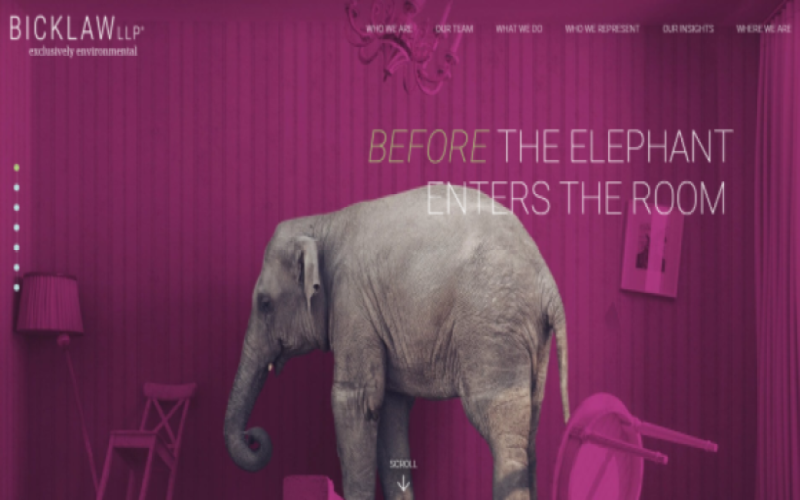
Bicklaw LLP
BICKLAW LLP catches your eye the moment you land on the homepage.
Key features
-
Eyecatching/Modern home screen
-
Precise guidance while scrolling with approachable
-
Quick facts/information in easy to handle tabs
-
Expressive accent pages with easy to grasp information
-
Quick team insights/evaluation
Spotlight Page: Who We Represent
With 15 key industries represented by BICKLAW LLP, this website takes design to a whole new level. Not only are these industries played out in suitable order but they are thoroughly investigated and represented by key attributes of the law firm. Kindly breaking each section into definition/history, subcategories, and future expansion exclusively environmental.
The theme of the environmental law firm focuses on just that. Incorporating earth tones but with a modern flare, easy to follow guide for a testy topic. Finishing off with insights to back their work and overall repertoire.
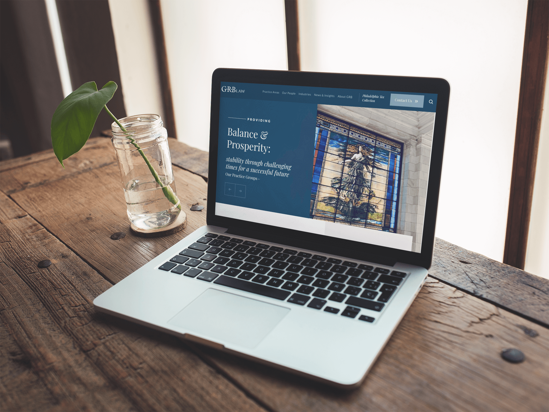
GRB Law
The new website is a modern twist on GRB Law's long-standing tradition of expertise. Highlighting the strength of their team, the GRB Law website includes dynamic, engaging attorney bio pages that encourage website visitors to explore expertise, read related articles, and download attorney Vcards. Custom mega menus, a comprehensive resource section, and intuitive site search round out the strategic functionality updates.
For a lot of law firms, it can be a challenge to organize all of the service content in a way that makes sense for prospective clients. The website information architecture needed to bridge that gap by communicating important service details through intuitive categorization. Here at Blue Archer we decided that a more dynamic mega menu approach would work best for GRB’s prospective clients.
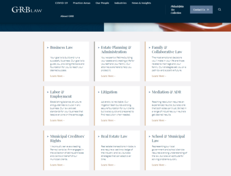
Spotlight Page: Practice Areas
This section enables website visitors to view practice area details within each law group before clicking through to learn more. This not only decreases the use of the back button on the site, but more importantly it ensures users have appropriate context for every action they take on the site so they can locate the information they are looking for quickly and effectively.
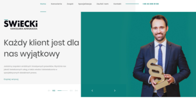
Swiecki
Unfortunately, we cannot speak to the language here as it is in Polish, but when you visit Sweiecki the design speaks for itself. A clean, modern approach with just the right amount of color and direction.
Key Features:
- Cohesive team pages, with an energetic vibe. Makes you want to say "hello" or "czesc" in this case!
- Icons are used as guidance on their specialization page. This is especially nice for non-native speakers.
- Pure and fresh feeling throughout the user experience
Spotlight Page: Zaufali Nam "They Trusted Us"
This page is a new take on "check us out" by acknowledging brands that have used their service. They open their page with a remark:
Rezultatem naszej dobrej pracy i osiąganych sukcesów procesowych jest stale rosnące grono Klientów.
The result of our good work and achieved process successes is a constantly growing group of clients.
Throughout the website, you can see they take pride in their work and focus on the clients at hand. With the focus on their team through the pages, the value placed on communication and team effort is apparent.
Groom Law Group
Groom's website expresses that they get down to the nitty and gritty. Working to the center of benefits, health, and retirement. The landscape of this design is quite on point for older generations and ultimate planning ahead.
Everything about this design scream sophistication and trust. Their menu options are bold and big, for easy navigation. This is important with services like these as big choices are usually ahead and with this layout, it makes it a bit less cluttered.
This is a larger group, as you can see by the Attorney and Professional page. The layout here is simple and to the point. Another interesting thing to note is that each page has a quote from a member of the team. This is a nice reminder as visitors flow through the site to feel as though it is a team effort. Pages are not long, as we have seen with other sites with the endless scroll feature. We are seeing a more traditional layout here, which aids in the practices this lawfirm supports.
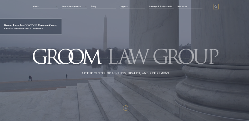
Page Spotlight: Groom Homepage
Although this is not a specific page to call out in comparison with other sites, the homepage is one of the most important features as this is the first impression.
To start, the page displays a widescreen video of conversation, brainstorming, and landscape. All three of these things allow users to paint a picture in their mind. We then move down the page where we find out exactly what they do, and resources to prove their reliability and involvement in the community. Simple yet informative and we are not bombarded with an ample amount of information to confuse users.
Counter Tax
Taxes are not fun, we all know this! However, Counter Tax's website brings back the ambiance of solving problems and getting through them with eas.
Key Features:
- subtle, yet colorful design with a clean white background
- A clear statement of what they do on the homepage and assertive efforts
- Two-option approach "Who are we?" and "Who need us?"
- Solid Tax focus for all small-medium business needs
Page Spotlight: Countermeasure
This page provides a video that explains their purpose and the software built to help their customers. Who doesn't love videos?
Check it out here.
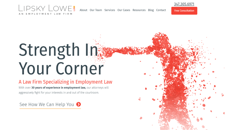
Lipsky Lowe
This one is interesting. Some of the designs of Lipsky Lowe reminds us of print design - particularly the use of double columns in the "over 30 years focusing on employment law" section. The team pages have videos fo each attorney, too, which is a good way of making the content super personal!
As we mentioned, the design reminds us of print. As you scroll down the homepage there are pictures to accommodate sections, hard-aligned margins, and an easy-to-read flow for all visitors. Even under their service page, it's a simple heading to description flow.
If you wanted to grasp the history of the firm by looking at their recent cases, you can by simply going to the "OPur Cases" section. This section is almost the exact same as a major online publication website with bolded titles and an intro to match.
Page Spotlight: Our Team
This page is unique in a way that each team member has a video to showcase their personality and experience. Here you can see Douglas Lipsky's personal video which is a personal approach of getting to know who is working for you!
This is a fun and professional way to grasp what exactly the firm does as well as how they got there. All in all, this displays confidence.
Quick Facts
How should you format your law firm website content for easy scanning?
Format your content to make it as easy as possible for visitors to scan your site, while also conveying the information you believe is most valuable. Some of the best ways to format for scannability include writing engaging headlines and subheads, using bulleted lists, using modern/easy to grasp language, and incorporating graphics to break up heavy blocks of text.
How can I incorporated a Call To Action into my law firm website?
Law firm websites should always give users several ways to quickly get in touch with the firm. Some tactics for accomplishing this well include a general inquiries Contact form, a phone number in the website's header so it appears on every page, and email addresses for individual attorneys listed on their profile pages.
Should I have a blog on my law firm site?
Most great law firm websites have, and maintain, a blog. Content creation can be made a priority in your firm by posting once a month, while encouraging other attorneys to think about ways to extend the life of their content.
Have other questions or want to chat about your law firm website? We're here to help. Give us a ring.
Search
Tags
Latest Blog Posts
- ChatGPT Atlas: Meet the Browser That Brings AI to Every Tab
- What Pittsburgh Businesses Can Learn from the New Pittsburgh Airport Terminal
- Generative Engine Optimization: Strategies to Win in AI
Rss

Rss Archive