Life is full of transitions from sunrise to sunset! Website Transitions are the animated changes between two pages or views. Transitions are developed through any kind of design element and can obtain more than what meets the eye. Which transition type is best for your brand?
Sometimes, in life, when change happens drastically it throws us for a loop. Then, the path is unclear...
Any time a user’s experience is interrupted, the chance of them leaving increases. When the user has to wait for new material to generate or look at a blank page while the actual material comes up on the screen, the chance of losing that viewer increases.
Poor transitions are directly responsible for high bounceback numbers and users leaving websites when they are forced to wait too long or are unable to find the information they seek. Preventing these losses requires that a brand's website uses the solutions necessary to provide fast page changes.
When a user clicks a link that directs them to another section, they should be transferred to the new page as quickly as possible, preferably in less than a second. Although the user only sees the page changing, there is much more happening on the back end a site that web development companies must consider to have efficient transitions, such as the following:
- Different Effects – Consider the various ways that new pages can be effectively served on a site. Not every transition will work well for every website, so it is important to find the best style for each site. Start by analyzing the information you are providing. For example, a law site will want quick, to the point transitions for easy data access whereas a Zoo website might want a more vibrant and geometrical attribute to show off an experience.
- Understand How Transitions Work – Smooth transitions require fluent functioning to bring up a new page, change the current url, then parse the two pages, and display any new elements and animation effects. Unless all of these functions communicate well and work together, speed and page generation can be compromised. Speed is highly important to users! The difference of one second could increase your bounce rate and decrease conversions.
- Improve Efficiency with Improved Function – A website development company can look into optimizing how they operate. Some examples include pre-loading the next section on hover or using a partial output function to reduce the server load, therefore the material can be delivered faster.
Scroll Transition Examples
Let's start with our very own Blue Archer homepage! As you can see, this page is an example of a Lazy Load design where everything loads softy as you scroll.
- Lazy loading means loading text on websites asynchronously — that is, after the above-the-fold content is fully loaded, or even conditionally, only when they appear in the browser's viewport. This means that if users don't scroll all the way down, text placed at the bottom of the page won't even be loaded.
- Check out Five Ways to Lazy Load Images for Better Website Performance
Scroll Transitions are a powerful way to enhance and delight user experiences. Choosing the right transition between pages can enhance visual impact in digital storytelling. The main purpose of transitions is to create a natural demonstration that something has changed.
Check out these examples:
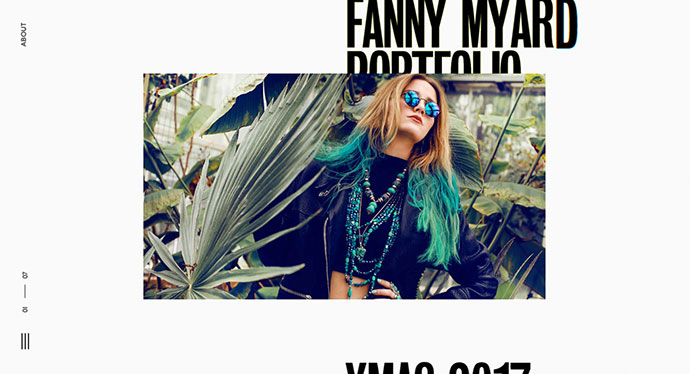
1. Patrick Heng
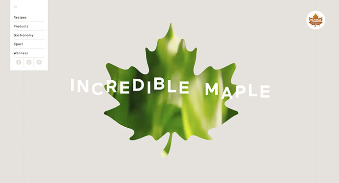
2. Maple
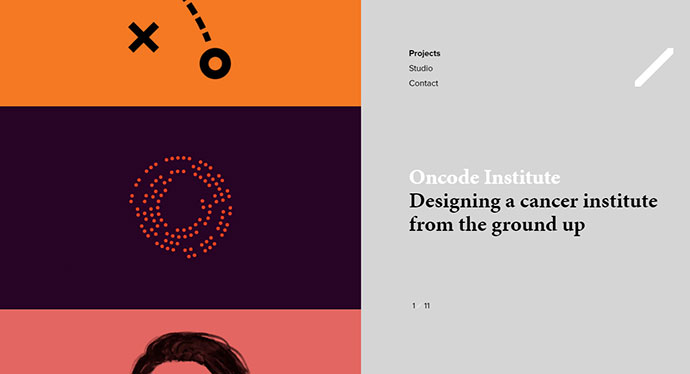
3. Momkai
Want to take a whack at it?
Page Transition Examples
Page transitions represent a practice that’s often overlooked in web design, and that’s a shame considering how impactful they are. They can change the entire feel of a website and the experience that visitors have with it.
Many designers tend to avoid animations because they believe that they are resource eaters that will only drag the website down and make it slow. That happens only if animations are not implemented correctly, and here’s where CSS page transitions change the game.
- folio. transitions
- Pagination & layout with clipped background div's
- Slider transitions
- Lollipop Transition
- Kontext
- Cool Layout with Complex Chainable Animation
- Uber-like text transitions
- Split 3D Carousel
Awwwards Has many great examples of websites who have conquered the transition game!
3D view product transition - AR fake sneakers & Ballsystem
Click and hold transition - Yuto Takahashi & Hello Today
If we take a look at how mobile apps are designed today, there is very often some sort of animated transition between states. Even ready-to-use native components have some kind of simple animation between states. Developers and designers realized that this little animation helps a user grasp what is happening in the app. It makes navigation through the app easier and tells the user where they are going within the app.
When you’re developing a website, it’s easy to spend hours making sure the user sees the whole story by way of top-notch transitions, like the movement between gallery pictures or fancy hover effects…but once a user clicks a link, all of that experience falls apart and you’re starting from the beginning. That’s because the page reloads!
A simple fade out/fade in seamlessly improves experience user has before the click of the link and doesn’t act that disturbing as a normal browser reload would. The loading indication on a menu icon ensures a user doesn’t panic in case the page takes little longer to load.
Some interesting animation can be achieved by animating different elements in different ways, which can also be combined with fading.
Check out these winning categories from Webby Awards!
- Best Navigation and Structure -Sites that offer the best possible user experience through superior navigation and site structure. Only information architecture will be judged.
- Best Use of Animation or Motion Graphics - Sites that integrate animation or motion graphics in a seamless, superior way that enhances the user experience. Only animation and motion graphics judged.
- Best User Experience - Sites that offer the best user experience through innovative design, and useful functionality.
Quick Facts
Do I need a page transition?
- Yes! This will help users navigate your website without being bombarded by information and load times. It's that extra touch that distinguishes your site from others.
Should I build my own page transition?
- CSS page transitions can be complicated or simple. It all depends on the look you are trying to portray to your audience. The best case is to contact a design company that adheres to your overall creative goal.
Can transitions become distracting?
- Of course, especially when the transition is not giving off the exact story you want to portray. Also if your transition is slowing down your page speed, this can become a larger problem with loss of interaction and an overall increase of bounce rate.
Looking to add transitions to your website? Contact Blue Archer today!


